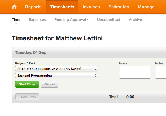
Today we’re excited to launch a new simple navigation. This new navigation is only one part of a larger effort to make Harvest better for tablets and touch devices, and clear up some usability issues. We’re launching this in preparation for a couple of big updates coming this Fall.

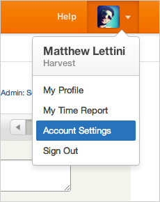
The new navigation is designed with larger click/tap areas, which make it easier to get around within Harvest. The new look is visually simpler and out of the way, allowing you to focus on the important bits below. It also introduces a new Profile Menu (click your profile photo in the upper-right of the new navigation) which offers quick access to your profile, weekly time report, and sign out. Tip: Add a profile photo if you haven’t already.
Note to Administrators: A common support question we hear is where an administrator can change their Account Settings. We’ve made now made Account Settings easier to get to by moving it from under the Manage tab to its new home: the Profile Menu.

Along with the visual updates, the code behind the navigation is much cleaner and lighter. We’re really excited to launch this upgrade. Enjoy, and let us know what you think.


