This Thursday, we’re releasing a significant update to the Harvest layout: the app will have a wider, borderless shell. The look and feel of Harvest largely remains the same, but you’ll notice more breathing room throughout the entire app. We’ve come to affectionately refer to this update as Harvest HD.
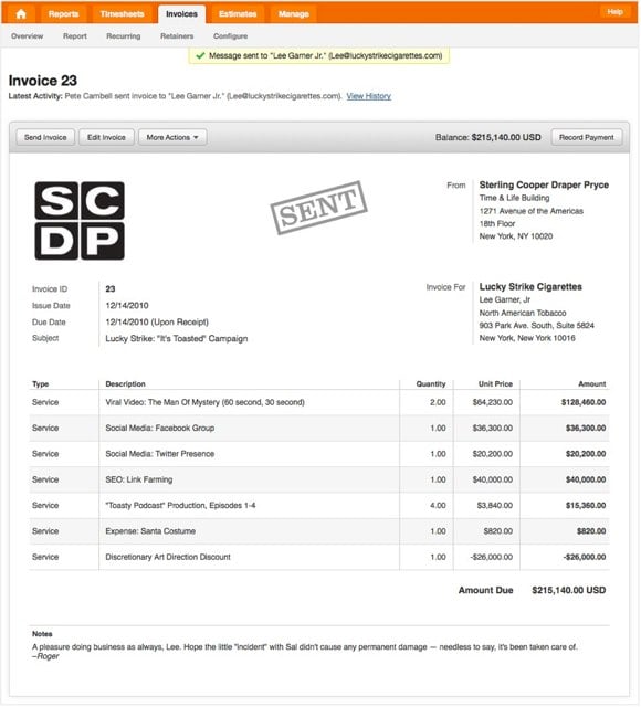
Over time, we’ll be using the extra space to make layout changes that increase usability. We’ve started making some of these additional improvements on the Invoice and Estimates page. Some changes you can expect on Thursday include:
- Grouped action buttons inside a chrome.
- Updated read-only layout that’s the same as the recently updated Web Invoice.
- Cleaned up header, where you can quickly see the most recent action taken on the invoice or estimate.
Here’s a preview of what the invoice will look like:

Later this week, we’ll publish a separate blog post detailing the technical side of the new layout. Stay tuned!


