 iPhone
 Android


What is Accessibility in Timesheets?
Accessibility in timesheets refers to the design and implementation of time tracking systems that are usable by individuals with a variety of disabilities. This includes ensuring that timesheets are navigable by screen readers, have intuitive interfaces for individuals with cognitive disabilities, and are operable without the need for a mouse. Making timesheets accessible is not just about compliance with legal standards like the Americans with Disabilities Act (ADA), but also about fostering an inclusive workplace where all employees can efficiently log their time.
Accessibility in timesheets is crucial for both ethical and practical reasons. Ethically, it ensures that all employees, regardless of ability, can fulfill their job roles without unnecessary barriers. Practically, accessible systems help avoid potential legal issues and can improve productivity by allowing all employees to participate fully in work processes. According to nisarlaw.com, non-compliance with ADA standards can result in significant financial penalties.
Consider industries like construction or healthcare, where precise time tracking is crucial for operational efficiency and regulatory compliance. In such sectors, ensuring that time tracking systems are accessible can prevent costly delays and errors. Moreover, accessible timesheets can enhance job satisfaction by empowering every employee to accurately record their own hours without assistance, fostering a sense of independence and capability.
Overview of WCAG Principles for Developers
The Web Content Accessibility Guidelines (WCAG) provide a set of principles that developers should follow to ensure their software is accessible to people with disabilities. These principles are Perceivable, Operable, Understandable, and Robust (often abbreviated as POUR). Each principle plays a critical role in making timesheet software user-friendly for everyone.
Perceivable means that users must be able to perceive the information being presented, regardless of the method used. For timesheet software, this might involve ensuring that text is readable or that audio feedback is available for visually impaired users. Operable requires that users can navigate and use the software, which means providing keyboard shortcuts for those who cannot use a mouse.
Understandable ensures that the software is easy to understand and use, with consistent interfaces and intuitive design. Finally, Robust refers to the need for the software to be compatible with a variety of assistive technologies, ensuring that timesheets can be accessed on different devices and platforms. According to reciteme.com, compliance with these guidelines not only aids users but also helps organizations avoid legal pitfalls.
By applying these principles, developers can create timesheet systems that are inclusive and adaptable, thereby enhancing the overall user experience. This approach not only aligns with legal requirements but also boosts productivity and satisfaction among employees who might otherwise struggle with inaccessible systems.

Common Accessibility Mistakes in Timesheets
Common accessibility mistakes in timesheets can hinder the usability for individuals with disabilities, leading to frustration and decreased productivity. One prevalent issue is illegibility, where font sizes or contrast levels are not optimal for users with visual impairments. This is a critical barrier, as it prevents the basic function of reading and entering time data accurately.
Another frequent mistake is the use of non-intuitive interfaces that confuse users, particularly those with cognitive disabilities. Complex navigation paths or unclear instructions can make it difficult for employees to log hours correctly, leading to errors and potential payroll discrepancies. According to deputy.com, organizations that have streamlined their interfaces see a reduction in user error and an increase in employee satisfaction.
To mitigate these issues, developers should prioritize user testing with individuals who have disabilities to gain insight into real-world challenges. Additionally, incorporating features like adjustable font sizes, high-contrast modes, and clear, straightforward navigation can vastly improve accessibility. These changes not only comply with accessibility standards but also enhance the overall efficiency of time tracking systems.
Specific Tools for Testing Accessibility
Testing the accessibility of your timesheet systems is crucial to ensure they meet the needs of all users. There are several tools available that can assist developers in evaluating and enhancing accessibility. Automated testing platforms, such as WAVE and Axe, provide quick and efficient checks for common accessibility issues, highlighting areas like broken ARIA labels or missing alt text.
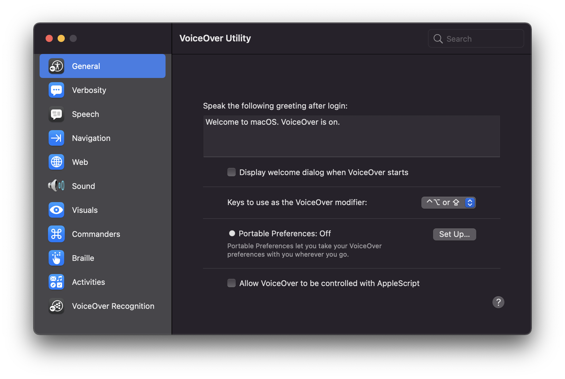
However, automated tools can only identify about 30% of accessibility issues, which is why manual testing remains important. Using screen readers like JAWS for Windows or VoiceOver for MacOS can help developers experience their software as a user with visual impairments would. This hands-on approach can uncover issues that automated tools might miss, such as logical reading order or keyboard navigation problems.
Incorporating both automated and manual testing into the development process ensures a comprehensive approach to accessibility. According to teamtrackin.com, businesses that employ both methods significantly enhance their software’s usability and compliance. This dual strategy not only meets legal requirements but also demonstrates a commitment to inclusivity, which can improve employee morale and the overall user experience.

How to Implement Accessible Timesheets Step by Step
Implementing accessible timesheets requires a focus on inclusive design right from the start. Begin by understanding the needs of all potential users, including those with disabilities. The first step is to adopt the principles of the Web Content Accessibility Guidelines (WCAG), which emphasize making content perceivable, operable, understandable, and robust.
Next, during the design phase, ensure that the interface is intuitive and simple. Use large, clear fonts and high-contrast colors to enhance readability. Avoid relying solely on color to convey information, as this can be problematic for color-blind users. Implement text alternatives for all graphical elements to ensure compatibility with screen readers. For example, a construction company might use icons on a timesheet to indicate tasks, but adding text descriptions ensures everyone can access the information.
Development should involve regular testing with accessibility tools. Screen readers and keyboard navigation are essential for ensuring that users who cannot use a mouse can still navigate effectively. According to empmonitor.com, integrating voice command capabilities can further enhance accessibility for users who have difficulty with traditional input methods.
Finally, conduct user testing with individuals who have disabilities to gain valuable feedback. This phase ensures that all accessibility features function as intended and provides insights into potential areas for improvement. By following these steps, your team can create a timesheet system that is not only compliant with accessibility standards but also inclusive and usable for everyone.

Digital vs. Paper Timesheets: Accessibility Comparison
When it comes to accessibility, digital timesheets generally offer more advantages over their paper counterparts. Digital systems can be tailored to accommodate various accessibility needs, such as screen reader compatibility, adjustable font sizes, and color contrast settings. Paper timesheets, on the other hand, are static and can pose challenges for individuals with visual or motor impairments.
One major benefit of digital timesheets is their flexibility. For example, they can be accessed from multiple devices, allowing employees with disabilities to use devices that best suit their needs. Plus, features like automated time tracking reduce the chance of human error, which is often higher in manual systems. According to tcpsoftware.com, automated systems can increase productivity by up to 25% for remote workforces.
However, digital systems also come with challenges. They require a level of digital literacy and access to technology that not all employees may possess. In contrast, paper timesheets are straightforward and require no special technology, making them more accessible in environments with limited technological resources.
Ultimately, the choice between digital and paper timesheets should consider the specific needs of your workforce. Digital timesheets are generally more adaptable and can meet a broader range of accessibility needs, but they require an upfront investment in technology and training. Paper timesheets might seem more straightforward but could lead to long-term accessibility and accuracy challenges.
User Testimonials: Accessibility Improvements in Timesheets
Real-life testimonials are powerful tools for understanding the impact of accessibility improvements in timesheet systems. Users often report significant enhancements in their workplace efficiency and satisfaction when such improvements are implemented. For instance, in the healthcare industry, where time tracking is crucial, switching to an accessible digital timesheet system has allowed medical staff to focus more on patient care rather than administrative tasks.
One user from a mid-sized construction company highlighted that after transitioning to a digital timesheet system, their ability to manage projects improved dramatically. The system allowed for easy tracking of employee hours and automated reporting, significantly reducing the time spent on manual calculations. As a result, the company's labor costs were reduced by 15%, as noted by kynection.com.au.
Employees with disabilities have also reported positive experiences. A worker with visual impairments shared that the new accessibility features, such as screen reader compatibility and voice command capabilities, made it easier to input and review their hours. This change not only improved their work experience but also increased their productivity.
These testimonials underscore the value of investing in accessible timesheet systems. They not only enhance operational efficiency but also contribute to a more inclusive work environment, leading to happier and more engaged employees.
Getting Started with Accessible Timesheets Today
Starting with accessible timesheets is simpler than it might seem. The first step is to evaluate your current system's accessibility features. Identify areas where improvements can be made, such as adding screen reader support or simplifying navigation. If you're using a digital platform, explore its existing accessibility options and ensure they are activated.
For developers, leveraging resources like the Web Content Accessibility Guidelines (WCAG) is essential. These guidelines provide a robust framework to make your timesheet system more accessible. You can also tap into community support through forums and groups dedicated to accessibility in tech. Training sessions and webinars can be invaluable for staying updated on the latest best practices. According to workstatus.io, automating reminders and simplifying user interfaces are practical steps that can enhance accessibility.
Developers should also consider integrating tools that test for accessibility compliance throughout the development process. Automated testing tools can flag issues without requiring manual checks, saving time and ensuring that accessibility measures are consistently applied.
By taking these initial steps, not only do you improve your system's compliance with accessibility standards, but you also create a more inclusive environment for all users. This proactive approach can lead to increased satisfaction and productivity across your team, making accessibility a worthwhile investment in your timesheet system.
Frequently Asked Questions
What are the 4 principles of accessibility?
The four principles of accessibility are Perceivable, Operable, Understandable, and Robust. These principles ensure that all users, including those with disabilities, can access and use digital content effectively. Perceivable means information must be available to the senses, operable refers to functionality being accessible, understandable ensures clarity, and robust means content should be compatible with current and future technologies.
What are common timesheet mistakes?
Common timesheet mistakes include illegible handwriting, missed time entries, and calculation errors. Other frequent issues are duplicate entries due to using multiple systems and failing to log breaks or overtime accurately. These mistakes can lead to payroll inaccuracies and time management challenges, ultimately affecting productivity and employee satisfaction.
How can developers improve timesheet accessibility?
Developers can improve timesheet accessibility by implementing clear layouts, using high-contrast colors, and providing keyboard navigation options. Additionally, incorporating screen reader compatibility and ensuring all interactive elements are easily accessible will help users with disabilities. Regular user testing with diverse groups can also identify barriers and enhance overall usability.
What tools help test accessibility in timesheets?
Tools like WAVE, Axe, and Lighthouse can help test accessibility in timesheets. These tools evaluate web applications for compliance with accessibility standards and identify potential issues. Using automated testing in conjunction with manual reviews ensures a comprehensive assessment, leading to better-designed and more inclusive timesheet systems.
Why is accessibility important for timesheets?
Accessibility in timesheets is crucial to ensure all employees can accurately record their time, regardless of their abilities. This inclusivity promotes fairness and compliance with legal standards, reducing the risk of discrimination claims. Furthermore, accessible timesheets can enhance productivity and employee satisfaction by allowing everyone to participate fully in the time-tracking process.


