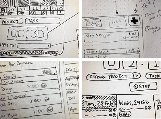
Since the beginning of this year, we have been working on an ambitious project to re-think and re-imagine the most critical part of Harvest: the timesheet. We’re close to having something to show you. The first piece that will be ready is the new mobile view, which you can now sign up for beta testing.
Overhauling Six Years of Technology
The Harvest timesheet you use today went through a redesign over two years ago. The code is about six years old (as old as our business), improved and patched up over the years. This time we are building a completely new timesheet from scratch.
There aren’t any major problems with the timesheet today. In fact, the most common feedback we hear from our customers is that they love Harvest’s simple and beautiful design. But we’re not satisfied with it. We, as designers and developers, have evolved over the years, so has the web as a platform, and its technology. We are not improving the timesheet just to make it new. We believe we can create an even simpler and faster experience.
Why Mobile?
For the new timesheet, we decided to start mobile. To us, it’s also the most interesting platform to design against: with its small screen and natural restrictions, we are forced to be more disciplined with what we can show and do on screen. We also believe that timesheet should be mobile; it’s an activity that should not be chained to your desktop, and the information should be simple, succinct and clear, at a glance, on a tiny screen.
Mobile is the least intrusive way to experiment with a new technology without affecting our customers. We’re using a radically different way of building the new mobile timesheet (based on Backbone.js) – Dee, our main developer for the new timesheet, will write a more in-depth article about how the new timesheet is built. There is a lot going on behind the timesheet’s deceptively simple user interface. The goal here is to make it super fast and responsive (by that, I don’t mean being responsive with the layout, but responsive in terms of feedback to the users).
Looking Ahead
The plan is to launch the new mobile beta, to test out the new design and technology. Our hope is that once you start using it, you won’t really notice the difference. It should be smooth and mostly familiar. The changes are subtle: lighter, simpler, clearer, with a couple of tweaks to make time entry even faster. The big changes are all happening behind the scenes. We will be writing a few blog posts to share with you what we did and learned.
We are excited about this project and cannot wait to share it with you.


