


We have done a major overhaul to the reports interface. There is a new navigation system for changing the timeframe, and the header has been expanded for better readability.
Why we did it
There are two main reasons. One is that we wanted a timeframe navigation system that ties in better with the actual reports. The other is that we needed to make room for other kinds of reports – so far we have estimates and expenses, and there will be more to come – in the sub-navigation.
What we did
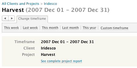
The report title now has a breadcrumb that precedes it. So when you click into a report, say you’re looking at a person’s hours for a project, you’ll find a breadcrumb above the title so that you can travel back to the project or client level.
Right below the title is an area with buttons of common functionality you need to access quickly – change timeframe, print, export. Change timeframe has replaced the old timeframe shortcuts, which you will still find if you click on the button. ‘Custom timeframe’ now has pop-up calendars to help you pick dates with ease.
Below the control area is the new report header, which is now wider with larger type inside.
We believe these improvements will significantly improve your experience with Harvest reports. We’d love to hear your thoughts on the new interface – please feel free to contact us: support (at) getharvest.com.


