


What Is the Account Overview Screen?
The Account Overview Screen is a powerful tool designed to provide users with a comprehensive dashboard of their account metrics, making it easier to access key information quickly and efficiently. This screen consolidates essential data into one view, allowing users to monitor real-time data, navigate through user-friendly interfaces, and keep track of personalized account metrics. It’s a game-changer for anyone looking to streamline their account management process.
One of the standout features of the Account Overview Screen is its ability to display real-time data visualization. This dynamic approach means users aren't stuck with static reports but can interact with data as it updates, which is crucial for making timely decisions. According to monday.com, interactive dashboards are becoming increasingly important as 98% of CFOs are investing in digital transformation tools to gain real-time insights and improve decision-making.
Getting started with the Account Overview Screen is straightforward. Begin by setting up your account preferences to tailor the dashboard to your needs. From there, familiarize yourself with the navigation to ensure you're utilizing all the features effectively. A practical tip is to regularly review and update your settings to match any changes in your business goals. This proactive approach will help ensure that the data you see is relevant and actionable, making your account management process as efficient as possible.
How Does the Account Overview Screen Benefit Users?
The Account Overview Screen offers numerous benefits that can significantly enhance user experience and account management. By providing a centralized platform for accessing key data, it streamlines the decision-making process and saves time.
One of the primary benefits is improved decision-making. With real-time access to account metrics and visualized data, users can make informed decisions quickly. This is vital in fast-paced industries where timely decisions can impact the bottom line. For instance, financial services rely heavily on dashboards to track KPIs like revenue growth and customer lifetime value, enabling rapid, informed decisions.
Moreover, the Account Overview Screen enhances time-saving capabilities. Instead of sifting through multiple reports or pages to gather information, users have everything they need in one place. This consolidation of information reduces the time spent on administrative tasks, freeing up more time for strategic activities. According to fanruan.com, a well-designed UI can increase conversion rates by up to 200%.
Lastly, enhanced account management is another key benefit. By having a holistic view of their account, users can manage resources more effectively, identify trends, and anticipate future needs. This proactive approach not only improves efficiency but also helps in maintaining a competitive edge in the market.
Digital vs. Competitor Tools: How Does the Account Overview Screen Compare?
When comparing the Account Overview Screen to similar tools offered by competitors, several unique features stand out that provide a competitive edge. The screen is designed to be both comprehensive and user-friendly, making it a preferred choice for many users.
A significant advantage of the Account Overview Screen is its real-time data visualization, which is a step above many competitor tools that may still rely on static reports. Real-time data access means that users can adapt to changes as they happen, rather than after the fact. This feature is increasingly critical, especially as financial dashboards evolve towards real-time interaction, as noted by hatchworks.com.
Another unique offering is the screen's mobile-first design. With 63% of internet traffic originating from mobile devices, ensuring that the Account Overview Screen is optimized for mobile use is crucial. Competitor tools that lack this feature may fall behind as users increasingly demand mobile-friendly platforms. This design choice aligns with the trend that 80% of internet users own a smartphone, making mobile responsiveness not just an option but a necessity.
The Account Overview Screen also offers personalized account metrics, allowing users to tailor their dashboard according to their specific needs. This customization is not always available in competitor tools, giving users of the Account Overview Screen a more personalized and efficient experience. These features combine to make the Account Overview Screen a leading option in the market, offering tools that not only meet but exceed user expectations.
Common Mistakes to Avoid When Using the Account Overview Screen
Although the Account Overview Screen is an intuitive tool, there are common mistakes users should avoid to ensure they're getting the most out of it. Awareness of these pitfalls can lead to better accuracy and efficiency in managing account information.
One common mistake is neglecting to regularly update account settings. Users often set up their dashboard once and then forget to revisit it as their business needs evolve. Regular updates ensure that the data displayed remains relevant and actionable. Neglecting this can lead to outdated information that might affect decision-making processes.
Another issue is overcomplicating the interface with too much information. While the Account Overview Screen is designed to handle comprehensive data, cluttering it with unnecessary details can detract from its utility. A minimalist approach, focusing on key performance indicators (KPIs), can help maintain clarity and effectiveness. Experts from bny.com suggest a clean, minimalist layout for executive financial summary dashboards to avoid clutter.
Finally, users often overlook the importance of mobile optimization. With a significant portion of traffic coming from mobile devices, ensuring the screen's mobile responsiveness is crucial for accessibility and usability. Failing to optimize for mobile can lead to a frustrating user experience, potentially driving users away. By being mindful of these common mistakes, users can maximize the effectiveness of the Account Overview Screen and enhance their overall account management experience.
User Testimonials: The Effectiveness of the Account Overview Screen
The effectiveness of the Account Overview Screen is best illustrated through firsthand user testimonials and case studies. Users have reported significant improvements in workflow efficiency and time management. For instance, a marketing agency noted that the real-time data provided by the screen allowed them to reduce their weekly meeting time by 30%, as team members could access the necessary project updates individually. This enhancement in productivity aligns with the broader trend where businesses that invest in user experience see a 9,900% ROI, emphasizing the financial benefits of an intuitive interface.
A frequent user of the Account Overview Screen, a project manager from a tech startup, shared that the screen's ability to consolidate metrics like logged hours and invoicing into a single view helped their team stay aligned on project goals without the need for constant check-ins. This not only streamlined their operations but also boosted their morale as they could focus more on creative tasks rather than administrative follow-ups. According to wearetenet.com, effective onboarding, which the overview screen facilitates, can lead to much higher retention rates.
In the world of finance, quick access to KPIs such as cash flow and revenue growth is crucial. One financial consultant praised the Account Overview Screen for its role in real-time decision-making, stating that it enabled them to spot trends and outliers faster than before. This capability is part of a larger movement towards real-time, AI-driven dashboards, which 98% of CFOs are investing in to transform their financial operations by 2026.
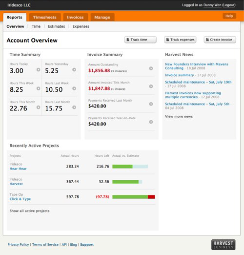
Visual Aids: Screenshots and Diagrams of the Account Overview Screen
Visual aids such as screenshots and diagrams can significantly enhance your understanding of the Account Overview Screen's layout and functionality. These visual elements bring clarity to how the interface organizes data and presents it in an intuitive manner. For many users, seeing a visual representation can make abstract data more accessible and actionable.
The layout of the Account Overview Screen is designed with simplicity and clarity in mind, aligning with expert recommendations for user-centric design. A minimalist layout is not only visually appealing but also allows users to interpret data quickly without unnecessary clutter. This approach is crucial as 88% of users are likely to abandon sites with poor user experiences, according to baymard.com.
Diagrams specifically highlight how different sections of the screen interact, such as the linkage between project tracking and financial data. These interactions are crucial for understanding how each part of the overview contributes to overall project management. For example, a diagram might illustrate the flow of data from time tracking to invoicing, showcasing how specific metrics update in real-time and how users can drill down into data points for more detailed insights.
By providing a visual walk-through, users can better appreciate the streamlined design and operational efficiency that the Account Overview Screen offers. This not only aids in faster adoption of the tool but also ensures that users can leverage its full capabilities to enhance their productivity and decision-making processes.
Frequently Asked Questions
What features are included in the Account Overview screen?
The Account Overview screen includes key features such as account balances, transaction history, and billing information. Users can also view account settings, manage subscriptions, and access support resources directly from this screen. This centralized interface simplifies navigation and enhances the user experience by providing all essential information in one place.
How does the Account Overview screen benefit users?
The Account Overview screen benefits users by providing a clear snapshot of their account status and activities. It enhances usability by consolidating important information, which allows for quicker decision-making and management of account settings. By streamlining access to critical features, users can save time and improve their overall experience.
What are the differences between the Account Overview screen and similar features in other tools?
The Account Overview screen stands out due to its user-friendly design and real-time updates, unlike many static dashboards in other tools. It integrates advanced analytics and AI-driven insights, allowing users to track trends and make informed decisions. Additionally, its mobile-optimized layout ensures accessibility across devices, catering to the needs of modern users.
How do I get started with the Account Overview screen?
To get started with the Account Overview screen, simply log into your account and navigate to the dashboard. From there, familiarize yourself with the layout and features available, including account balances and transaction history. If you need assistance, help resources are readily accessible within the screen to guide you through its functionalities.


