Recently Chris Wilson from Search Mojo has been writing to us with questions about the Harvest API. Through the pleasant conversations surrounding Chris’s questions, we learned that Search Mojo was using the API to create an inspiring dashboard. Here’s how Chris describes it:
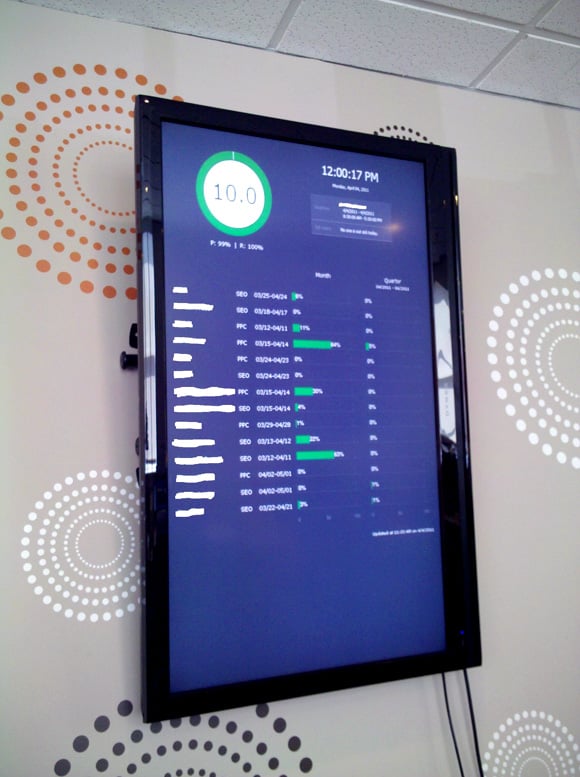
We created a profitability dashboard to total up which of our clients we are profitable on based on hours, hourly rates and expenses over quarter and month ranges. We then created a score based on that. Your API tool supplied everything and it’s officially up and running on the tvs in the office.

It turns out that they have set up two different dashboards, to keep the clients displayed relevant to the employees who can see the television.
At the top left corner is a score based on profit and retention from quarter to quarter by using Harvest and looking at last time stamps and active/inactive projects. The right hand side queries our other database to show vacation and sick leave.
Now onto the bulk of the system. It lists every client and project (column 1 and column 2 respectively). The next bars (one for monthly and one for quarterly) use Google charts to display graphs which include (hourly rate X each employee) + expense cost. We have 2 dashboards setup for our 2 teams in the office so it only lists their clients. This helps us to review our processes to determine which clients are too demanding and which we need to focus on more. As each employee spends more time the chart grows closer to 100% which means we are using 100% of the budget (or the amount the client is paying us). It turns yellow when between 80-100% and red when above 100% (meaning we are over budget and have allocated too much time), otherwise it’ll show green.

Thank you Chris and the whole Search Mojo team for sharing how you use the Harvest API. Those dashboards are an awesome way to utilize your Harvest data to keep tabs on profitability.
If you have an interesting use of the Harvest API that you would like to share, please let us know!


