


When we set out improving Invoices Overview, we had a vision of love. Okay, maybe not love. Fall’s just making me reminiscent for 1990s Mariah Carey. But we had a vision, it was pretty lovable, and it was called graphs.
Our vision grew out of a few basic desires.
- First, we want you to be able to understand the overall story of your invoices at a glance, so you don’t have to run quite as many reports.
- Second, we know comparing month-to-month activity is useful to understand progress and invoicing trends, and want to offer easy access to this info.
- And third, we want to offer a visual way to analyze your invoicing data.
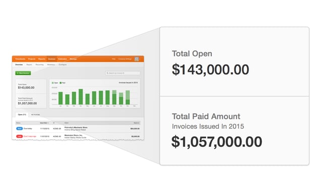
Over the next few days, we’ll release the results of that vision: a visual invoice summary at the top of Overview, including a new graph and two summary numbers. Currently, the graph shows the present year, and we’re working on support for other years as well.
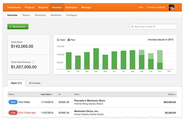
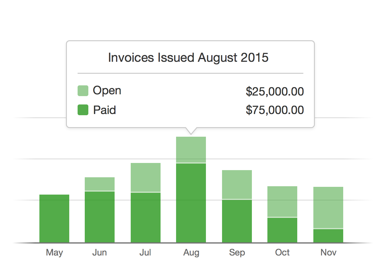
The graph itself will show you the invoices you issued in specific months. If you hover over a month’s bar, we’ll show you some details of the invoices issued in that month: you’ll see how much has been paid and how much remains open.
We also show you two summary numbers:
- The total open amount. This includes all unpaid invoices for all time, a great way to know what you need to track down.
- The total paid amount for invoices issued this year. A simple way to see how much money you’ve brought in for invoices issued since the year began.
Feel free to let us know your thoughts! We hope you find this new graph useful!
Editor’s Note: Changes were made to this post after it was released, to reflect updates made to the invoice summary graph. The graph’s open amounts now exclude written-off invoices, which is reflected in the monthly bars and the graph’s tooltips.


