Did you know that Harvest turned 11 years old this past March? That’s right, Harvest is approaching its teens! We’re proud and thankful that, with your support, we’ve been able to build a useful product that helps businesses both track time and work smarter.
But with that many years behind us, Harvest is starting to show its age—the design of Harvest hasn’t seen a major update in a number of years.
With each new project, we tend to focus on the experience, and not so much on overhauling the visual design. We’re usually content as long as something is clear and easy to use. But if you look closely, you can see that our treatments of type, color, layout, and interactions across different sections vary, sometimes wildly. Inconsistencies have developed as different designers have been responsible for different sections of Harvest.
Inconsistency makes things difficult to use, and while that difficulty can be subtle, it’s not what we want for Harvest.
Time to Refresh
We’ve been thinking about (and bothered by) our aging and inconsistent design for the past few years, and last summer we decided to step back, sit down, and make it a priority. Our goal is simple: to have an updated, unified, and consistent design experience throughout Harvest.
With 11 years behind us, it’s time to consider what Harvest should look like for the next 11 years. In a word, we want Harvest to feel “refreshed”. That’s a word we use intentionally. It’s something by which we hope our team and our customers can feel inspired and excited. We hope Harvest’s new visual design feels rejuvenated, playful (at the right times), opinionated, and uniquely Harvest.
Plus, a design refresh means new sections and features will be easier and faster to ship to you, our customers.
Starting Small: Phase One
We have a long way to go to fully realize our goal. Rethinking every detail of every crevasse of every section of Harvest is a daunting task. We started with some high-level thinking, envisioning a few beautiful futures of Harvest and a few not-so-hot ones. And in the past few months, we’ve made some good headway.
We’re now at a point where we’re ready to begin laying the groundwork for the future. While we’re not 100% sure what that future is, we’re ready to share our early progress.
We’re considering this release Phase One, and it includes some of the basic and fundamental directions of our new vision.
So what’s changing in Phase One?
1. A New Font: Fakt
When we started considering our design, we wanted to push it into new territory, and establish a unique voice for Harvest. The trouble was, our current font didn’t fit that vision. It’s an internet default, and it doesn’t feel like Harvest to us. It also has some rendering issues on the web.
So the team set out to test our assumptions that a new font could be one of the biggest changes to help Harvest feel rejuvenated. After deliberating many potential candidates, the team found a font that we feel not only adds a voice to Harvest’s new visual design, but that we enjoy!
Our new font, Fakt, is both clean and clear, rendering well in multiple applications, and comfortably riding the line between a geometric sans and a neutral grotesk. It offers the weights we need, and has nicely proportioned tabular lining numerals (important for an app like Harvest, with lots of tables of numbers).
Aside from meeting our needs, the team chose Fakt because it’s modern, easy to read, and brings a more playful attitude to our teenage app.

2. Updated Basic Components
Along with the new font, Phase One will include a few small updates to some core components. These updates simplify our multiple different styles, and lay the groundwork for our move towards a new and refreshed visual design system.
Buttons will be a bit brighter and bolder, and more consistent across all sections of Harvest. We’re also bringing updated treatments to our navigation, sub-navigation, and page tabs to match. There are only a few other small visual changes so far, but behind-the-scenes we’re starting to improve the structure and organization of our HTML and CSS—11 years can build up quite a few cobwebs.

3. Expenses Section Now Easier to Find
You might notice that this first phase of our design refresh doesn’t include any interaction changes, but we did work in one big architectural change.
The Expenses section will be pulled out of Timesheets, and have its own place in the main navigation. Also, Timesheets in the navigation will now be renamed to Time.
Expenses was traditionally difficult to find. Our customers simply don’t look for it in the Timesheets section—it doesn’t have anything to do with time! With this change, expense tracking will be immediately accessible from anywhere in Harvest.
Here’s a couple examples showing off Phase One:
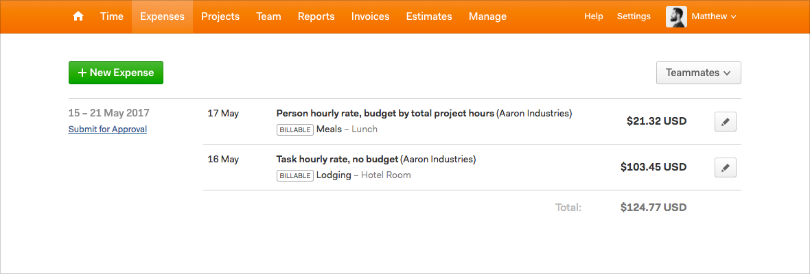 Expenses – Click to view full size image
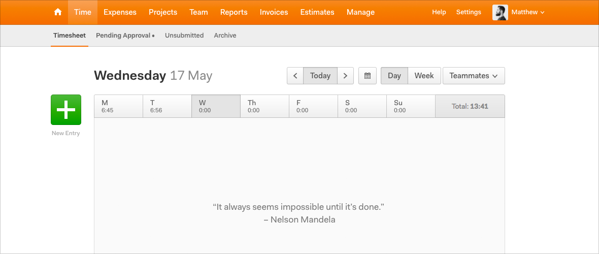 Time – Click to view full size image
Laying the Groundwork
Phase One will begin rolling out to everyone over the next few weeks. If you’re anything like our office manager, you might not even notice the changes (it’s true, she didn’t!).
But while these changes are subtle, the team is excited to lay this groundwork for a future vision of Harvest.
We’ll continue to tackle this project slowly, iterating on various sections of Harvest’s design over time. We’re not sure when the next phase will be coming your way, but we’ll be sure to let you know right here on our blog when the time comes.
Lastly, Harvest is also a large and old codebase. During this transition, some places might accidentally look a bit off—if you see something weird, or have any questions, please drop us a line!


